The floor
Van Gogh was so enchanted by his red tile floors that he described them in detail in a letter to his brother. So why don't they look red today?
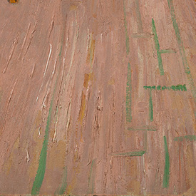
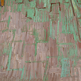
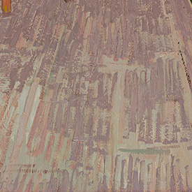
In the paintings we see today, the floor of the Amsterdam version is dominated by pinkish to purple colors with green outlines; the Chicago picture is the opposite, with a bright-green color contrasted by the outlines of the reddish-brown tiles. In the Paris version, purple-brown—with hints of green—is the dominant color.
Originally, Van Gogh painted different base layers for the floors: buff-colored for the first; a pale pinkish-brown for the second; and a light brown for the third. He then added another layer of various red pigments, which have altered at different rates over time. The different mix of original colors—as well as different brushstrokes and areas where paint has been lost (which started in Van Gogh's lifetime)—caused the floors to look different today than they originally appeared.
Discover more illuminating differences among these objects:


© Art Institute of Chicago