Museum professionals constantly seek new scientific methods to protect and conserve works of art from the ravages of time, humidity, extreme temperatures, and air pollution. One of the most serious problems facing painting, prints, and drawings is color fading due to overexposure to light. Museums often limit or adjust the amount of light in their galleries to minimize this damage, but they must balance the need to limit light with need to maximize visual pleasure for the museum visitor. Finding the balance requires the employment of a field called
cognitive science, a fundamental science for understanding the viewer’s experience of a work of art.
Color Constancy
In cognitive science, human perception begins with an infinite amount of photons, reflected from various surfaces, entering the eye. In the retina, cones register color as light enters the eye. There are three different types of cones in the retina: red, green, and blue. A red cone may be surrounded by a series of blue cones, or green surrounded by red, all of which are connected to the optic nerve, which in turn transmits information to the brain. In the brain, neurons are dedicated to specific purposes, such as registering lines, movement, color, and light.
In a museum, the spectra of light sources may vary from room to room: some galleries are lit by daylight while others are illuminated by artificial light. On the visible spectrum, outdoor light appears blue, and indoor light appears yellow, and the appearance of color in light is directly related to its temperature. When an object or substance is heated by light, it emits a glow. The hotter the temperature, the bluer the glow. For example, the flame of a lit match is hottest in the center, where it appears blue, and coolest on the outside, where it appears orange or yellow. Sunlight is a high-temperature light, so its reflected glow appears a cool blue. By contrast, artificial light, like that from a 40-watt tungsten lightbulb, is cooler in temperature, so its reflected glow is warm yellow. However, while the temperature of light striking an object may change, the human eye always perceives that object as the same color. This phenomenon is called color constancy. In the absence of a point of reference, color constancy works beautifully. When direct comparison is made between different temperatures of light striking the same object, the human brain will perceive pronounced contrasts in the color of that object.
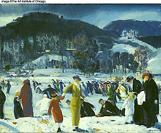
Demonstration of Color Temperature
We know that lights of different temperatures emit, or reflect, different colors, ranging from warm yellow to cool blue. We also know that while the eye and the brain receive and perceive information, such as lines, colors, and textures, through reflected light they do not necessarily perceive the temperature of light emitted by a source, except by contrast. Is it possible to determine whether color temperature has an impact on the viewing experience in a museum? Do viewers prefer a certain light temperature to another for looking at art?
Blackbody radiators are full-spectrum light sources. If one were to shine a high temperature blackbody radiator at a work of art, the work would at first look drab under the light. However, after a couple of seconds, the image would appear normal, that is. This normalization is an example of color constancy taking effect.
In an experiment involving curators, art historians, and conservators, the results of which were presented at the American Institute of Conservation Conference, each person was asked to indicate the lighting under which he or she preferred to view works of art. Surprisingly, almost everyone agreed on the same color temperature, regardless of whether the pigments used in the work were warm or cool. While science might reason that natural daylight would be the best light under which to view a work of art, most museum professionals chose light with a warmer glow (see video clip). Based on this study with museum professionals, one may conclude that humans are prewired to appreciate this particular color temperature. In other words, there may be an underlying neurobiological explanation for certain aesthetic preferences, or "tastes."
Adapted from a lecture titled "The Science of Good Taste" by Steven Weintraub.